
One of Gutenberg’s best features is that it allows you to keep the block’s visuals on the Editor, offering consistency between the backend and the frontend and a much more intuitive editing experience.
To begin creating your Editor styles, you just need to add the respective support and enqueue your CSS using add_editor_style(), like so:
add_theme_support( 'editor-styles' );
add_editor_style( '/your-theme-path/editor-styles.css' );
Most of the time, implementing the frontend’s CSS to the Editor is as easy as simply copying the block’s styles to your editor-styles.css (btw, the filename could be anything you want).
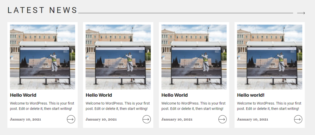
What might discourage you, though, when you do it for the first time, is that because of some editor-specific styles, things don’t look too close to the original. In fact, unless your frontend design doesn’t have a very narrow width, chances are that your block’s editor isn’t even user-friendly. As an example, here’s how a random custom block that I’m working on looks like on the frontend:
And here’s how it looks like if I copy and paste its styles in my editor-styles.css.
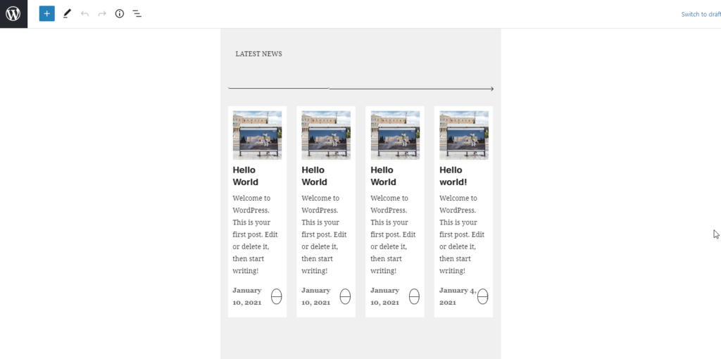
There are two problems here: The first one is that Gutenberg, by default, gives a very narrow max-width to its blocks, so if your block is meant for a wider display, it will not look good.
The second problem is that the styles of the title do not seem to get applied. If you investigate the code, though, you will discover that as the title is editable, its markup is different than the frontends on that it contains an extra textarea. So, while on the frontend we have something like <h2>Some text</h2> on the backend it becomes something like <h2><textarea ...>Some text</textarea></h2>. The <textarea> element has its own styles, which override our own.
To deal with those two issues, all we need is those two lines of CSS:
.block-editor-block-list__layout .wp-block { max-width: none; }
.block-editor-block-list__layout textarea { all: inherit; }
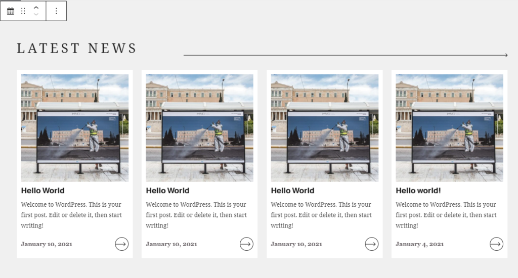
The first one removes the max-width from the blocks and the second tells the <textarea> element to inherit all the styles of its parent, whatever those might be. With just those two lines of CSS, our block’s appearance looks much closer to the frontend’s:
Given that I try to replicate the frontend design on the backend as much as possible, copying those two lines is the first thing I put in editor-styles.scss on every custom WordPress project.
If you happen to have similar quick tips of your own, I’d be happy to read about them in the comments.
I don’t usually comment on stuff.
I’d like to thank you so much for publishing this. I’m no developer, I hack together stuff for my own means to an end for projects I do every day.
After finally embracing Gutenberg and spending the best part of an afternoon pulling out my hair trying to get styles to stick, to maintain some sort of visual consistency (hey that’s what the new editor is about isn’t it!) I was just about to throw in the towel as I couldn’t find much documentation or solutions to this and I everything I had tried was frustrating me, so much so that I felt like going back to the classic editor.
This solved ALL my issues and the styles were applied to the new wordpress editor.
I was initially looking in the browsers inspector, where an alteration would work, but in my custom css nothing seemed to stick. I probably could have inspected further and saw it was the textareas “in-line” elements overriding in the DOM. I didn’t think to do this, and as soon as i saw your line
“on the backend it becomes something like”
I knew what was happening, then employed your elegant solution.
We live and learn. (with a little help from our friends)
Once again, Thank You for your work.
Steve