Implementing a product comparison table can be challenging, especially when there isn’t any established “right way” of building it and dealing with some of its most usual requirements. But first, let’s see which those requirements are:
- It should be able to display a variable number of items. Eventually, you will set a maximum limit, but your user might want to compare 2, 3 or even 10 products if you allow it.
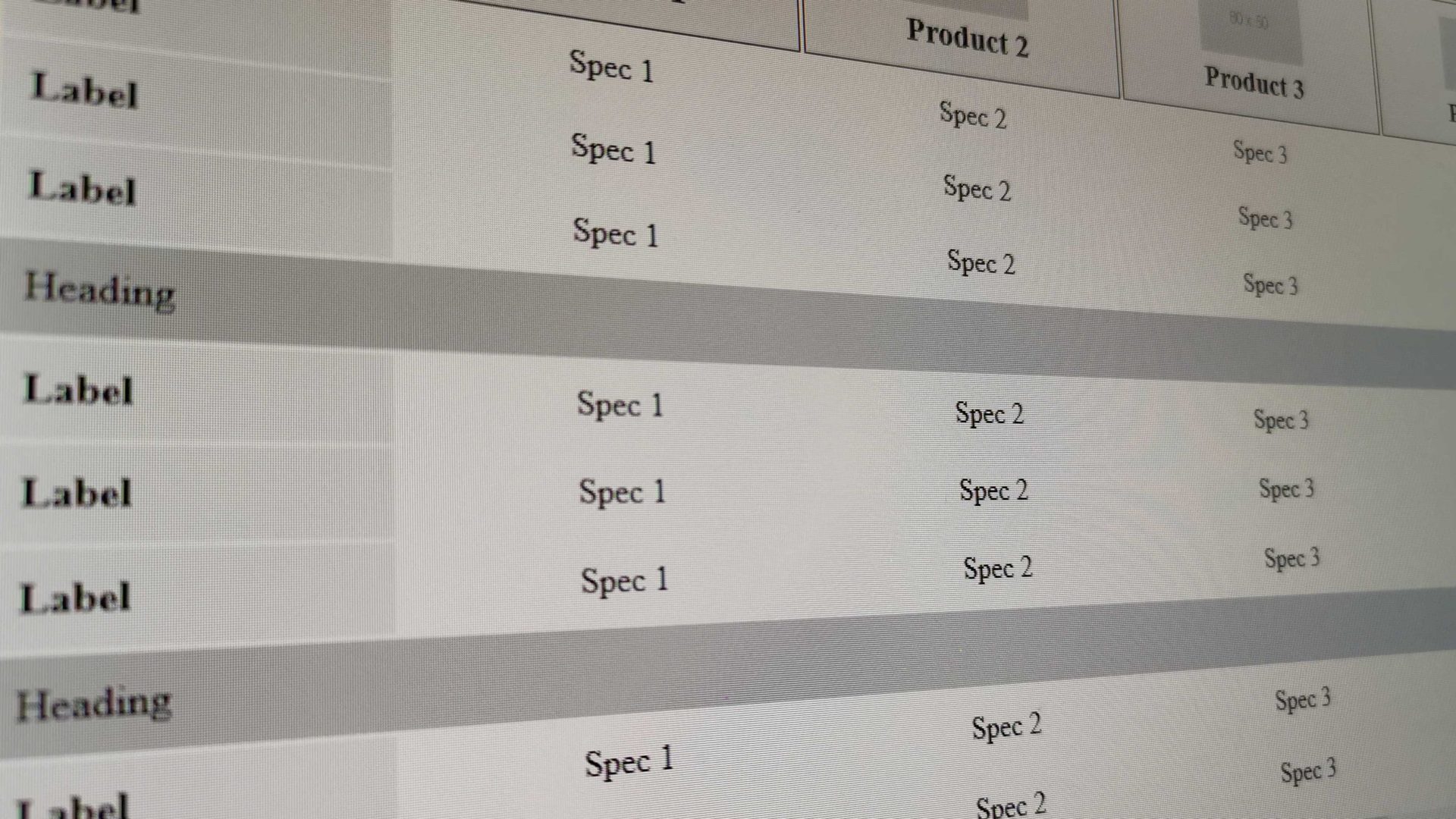
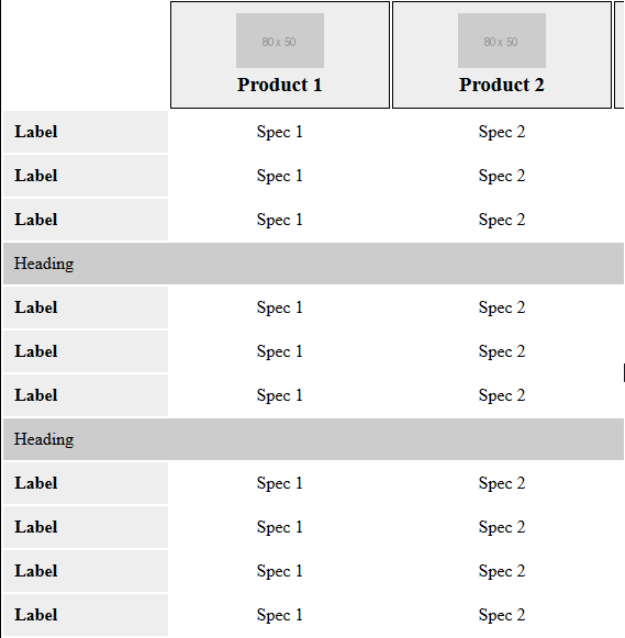
- The table’s header, which features the main products’ info should stick at the top as you scroll, maintaining the proper alignment with their respective columns.
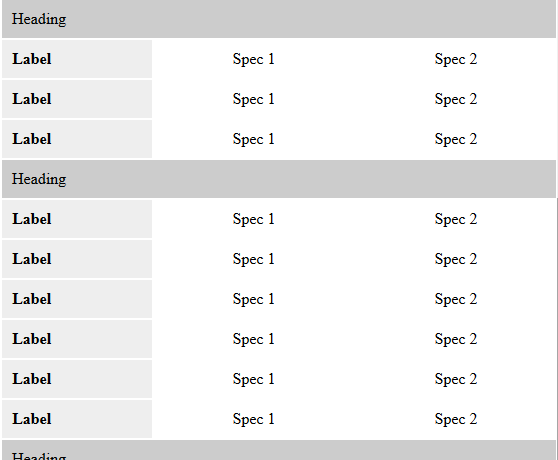
- If there are too many specs to compare, they should probably be organized in categories, with some heading before each specs bunch.
- And the greatest challenge of them all: make it adjust on mobile in a way that it’s actually usable.
Most real-life examples that I’ve come across handle those requirements with JavaScript, which often makes the experience quite weird and clunky. Sticky headers don’t stick too well, left/right buttons make mobile navigation seem unnatural, spec labels are vanishing on small screens or they are being repeated as hidden-on-desktop HTML elements above each spec. In a few cases, the developers choose to limit the number of comparable products to only two, to tackle those problems.
So, how can we deal with the aforementioned challenges cleanly and efficiently? We can create a simple table with a horizontal and vertical scroll when the available space becomes too small to accommodate the content. Don’t get thrown by the ugly desktop scrollbars, especially if you are on Windows. On a mobile device, scrollbars are invisible and precisely because we use the browser’s native scroll, the act feels completely natural. For the “sticky” part, it’s just CSS. Here is a rough demo:
Let’s break it down to its key points:
Use <table> for the markup
It seems obvious, but I’ve seen implementations trying to handle it with divs and flexbox, overcomplicating things for no reason. Back in the old days, tables were often being used as a way to built layouts. That very overuse gave them a bad reputation and I’ve heard people instinctively say that tables === bad and that they should be avoided in modern web design. In our case, though, tables are the ideal tool to structure our markup with the minimum amount of CSS. That’s why they were made for in the first place anyway.
Give columns a minimum width
Assigning columns a minimum acceptable width ensures that they will stay responsive until they reach a certain limit. Adapting the width below that limit would only break the functionality and make the table unusable. Instead, when we reach that threshold we prefer to display a horizontal scrollbar, which brings us to our next point:
Wrap your table to a container
We don’t know how many products a user might add on a comparison table. It might be anything between 2 and whatever our maximum limit is. Therefore, in some scenarios and below a certain screen size, there might not be enough horizontal space for the items to fit. To deal with it’ we wrap the table to a <div> container with the following CSS:
overflow: auto;
max-height: calc(100vh - #{$header-height});
Setting the overflow to auto ensures that if the items are too many to fit on the screen, either horizontally or vertically, a scrollbar will appear. We also want to set the container’s height to be equal to the viewport’s height minus whatever our site’s header height is. That way we keep the entire table visible on the screen all the time.
Use position: sticky;
To keep the table’s header always visible as we scroll, we can take advantage of the position: sticky; CSS property. It is cleaner, simpler and smoother than any JavaScrit alternative. The drawback is that it isn’t supported in Interner Explorer, which, if you ask me, is no big deal, since all you compromise is the sticky functionality. Apart from that, your table should be fine and usable enough even on a legacy browser.
Moreover, we can also use it to keep each spec’s heading visible when the user needs to scroll horizontally, which is a nice UX touch.
Use CSS attr() to handle labels on small screens
When you are on a large screen you will want to have the spec labels on separate columns at the left side of the table. As the screen gets smaller, though, there is not enough space and you inevitably want to hide the sidebar and show the labels above each spec instead. Most people deal with it by adding an extra span above each spec, hidden on desktop and visible on small screens only. Why duplicating your content, though, when you can take advantage of the super-useful CSS attr() function and its surprisingly good browser support?
Assing a special class depending on the number of products
To have better control of how the table should behave on different screens, it seems like a good idea to assign a special class depending on the number of products that it features (e.g. products-3, products-4, etc). That class can be assigned dynamically with PHP or whatever when the table markup is being built. From there, you can add additional CSS for every possible class, to make sure that the comparison table always looks nice, no matter what the user feeds it.
So, what do you think about this approach? I find it to be simple, clean and elegant, with a minimal amount of code. Eventually, you can easily extend it with additional functionality using JavaScript, adjusting to your specific needs, if you want. For example, you might want to add navigation buttons to move between products, add some extra styling and actions when the header sticks at the top and more.