Tabs on desktop, accordion on mobile became, for some reason, by far the most popular Pen I’ve ever done in CodePen. It was an experiment on how to deal with tabbed content on smaller screens, where there is not enough space for the horizontal tabs. My suggestion was to turn it to an accordion, as this seemed to be the most logical and user-friendly approach. Given that the Pen was created a few years ago, I thought I’d revisit it and make some improvements.
Eventually, the goal is to build is something that can adapt smartly, depending on the context and not on manually set media queries. On the GIF below, watch how the first component changes view automatically, while the second stays the same, as there is still enough space:
Challenges
Although implementing the general idea can be achieved in many ways, there were a few challenges that needed to be taken into consideration:
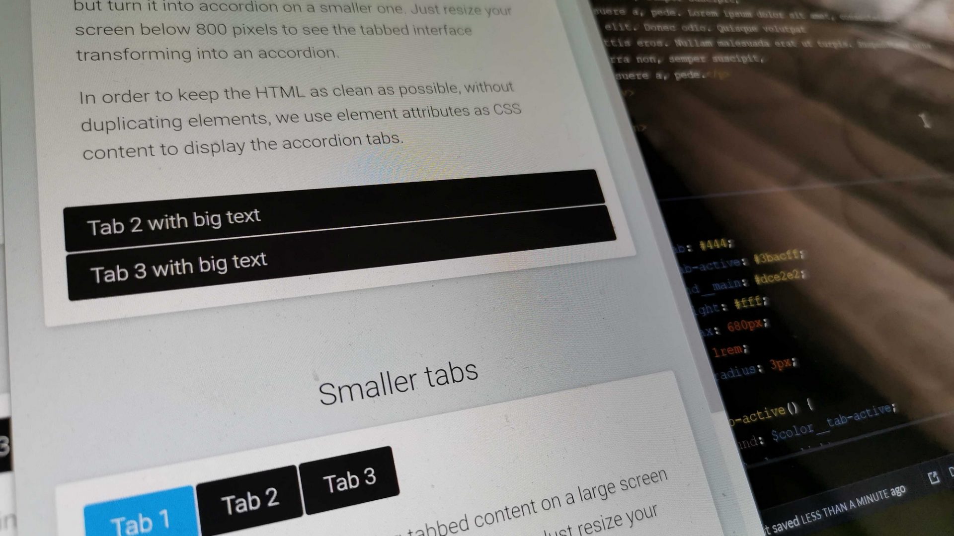
- Keep a clean markup. Probably the most obvious approach was to duplicate the accordion titles as tabs, toggling their visibility. Having duplicate elements would create a messy markup, though, and I’m not a big fan of it unless it is absolutely necessary.
- Dealing with unknown tab widths. The original Pen uses a specific breakpoint, assigned by hand, for the transformation from tabs to accordion and vice versa. The problem with that, though, is that in a production environment you can’t know how many tabs you will have and how long each one will be. Therefore, you can’t have one breakpoint for every occasion, but you need to adjust it every time, which is obviously not practical.
- Avoid jQuery. The original Pen used jQuery for the JavaScript parts, but there is no need for it anymore, as we can handle it with vanilla JavaScript – at least as long as we don’t care about legacy browsers (spoiler: I don’t, at least for this project).
- Replicating jQuery slideToggle() with CSS. The original Pen focused solely on the functionality, keeping very minimal transition effects. This works fine for tabs, but having an accordion without the slide up/down effect seemed lacking.
Implementation
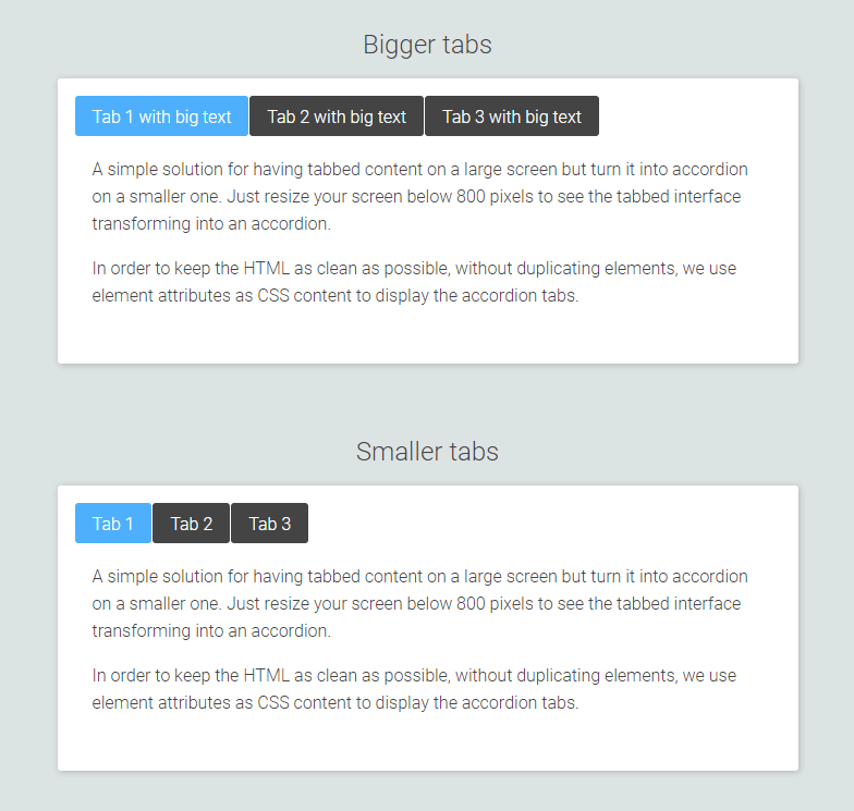
Normally, I’d go mobile-first, building the component around the accordion’s structure, as that’s the mode that appears on smaller screens. Tabbed content’s markup needs to be more specific, though, so we will have to use its structure instead. Then, as we go down, we can use a data attribute to get the tab’s title with CSS attr() and display it for the accordion.
Besides that, Tabs is the primary view of the component, as the accordion might never appear even on smaller screens, if the tab size is small enough to fit.
So, our base markup should look like this:
<article class="ootb-tabcordion">
  <div class="ootb-tabcordion--tabs">
    <button class="tab is-active" id="tab1">Tab title</button>
  </div>
  <section id="tab1-tab" class="ootb-tabcordion--entry is-active" data-title="Tab title">
    <div class="ootb-tabcordion--entry-container">
      <div class="ootb-tabcordion--entry-content">
        <p>Tab content</p>
      </div>
    </div>
  </section>
</article>
And the title on smaller screens could be captured with that:
.ootb-tabcordion--entry::before {
  content: attr(data-title);
}
Then, we use some JavaScript to measure the tabs’ total width and compare it to the container’s total width. Depending on that comparison, a .has-tabs class gets toggled accordingly, to indicate the mode we are on. This allows the CSS to know when to display the correct mode.
To identify when the containers’ dimensions change, we can use the ResizeObserver interface. This is much more efficient than using an onresize event, as it avoids infinite callback loops and cyclic dependencies that are often created when resizing via a callback function.
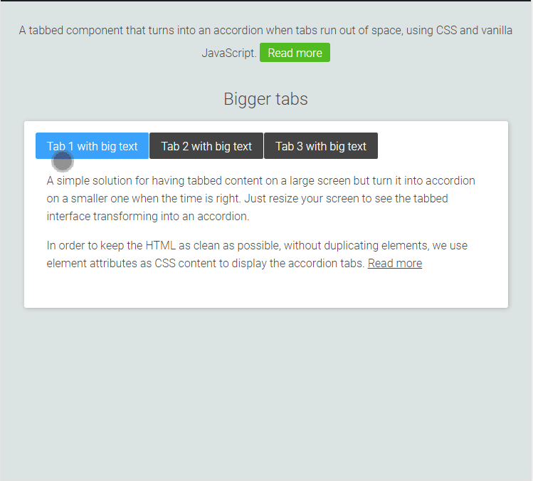
Lastly, mimicking jQuery’s slide() effect with pure CSS can be done with some negative margin-top and transitions, giving us the final result that you can see below. If you are on desktop, try to resize the screen and watch the tabs transforming to an accordion when they run out of space.
See the Pen
Tabs on desktop, accordion on mobile by Giorgos (@gsarig)
on CodePen.
Accessibility
As pointed out correctly by a few people on Twitter, the initial markup falls short on accessibility, as it doesn’t allow you to navigate with your keyboard. W3.org includes guides and best practices for both Tabpanel and Accordion. Of course, they are two different components with different markup, so I had to make a choice. As mentioned already, the component is first and foremost a Tabpanel, as the Accordion might even never appear under some circumstances. Therefore, I worked with the tabbed version first, adjusting the markup accordingly, adding the necessary WAI-ARIA Roles and Properties:
<article class="ootb-tabcordion">
  <div class="ootb-tabcordion--tabs" role="tablist" aria-label="Demo">
    <button class="tab is-active" role="tab" aria-selected="true" aria-controls="tab1-tab" id="tab1">Tab 1</button>
    <button class="tab" role="tab" aria-selected="false" aria-controls="tab2-tab" id="tab2" tabindex="-1">Tab 2</button>
  </div>
  <section id="tab1-tab" class="ootb-tabcordion--entry is-active" data-title="Tab 1" tabindex="0" role="tabpanel" aria-labelledby="tab1">
    <div class="ootb-tabcordion--entry-container">
      <div class="ootb-tabcordion--entry-content">
        <p>Tab 1 content</p>
      </div>
    </div>
  </section>
  <section id="tab2-tab" class="ootb-tabcordion--entry" data-title="Tab 2" tabindex="-1" role="tabpanel" aria-labelledby="tab2">
    <div class="ootb-tabcordion--entry-container">
      <div class="ootb-tabcordion--entry-content">
        <p>Tab 2 content.</p>
      </div>
    </div>
  </section>
</article>
Then, studying the JavaScript of the official example, a keyboardSupport() function has been created, to allow us to enable keyboard navigation. With those adjustments, when you are on Tabbed view you can navigate with your left/right keys between the tabs and select them pressing Space or Enter. When you are on the Accordion view, the left and right buttons become inactive, as now you can navigate through the panels using the up/down keys. On both views, pressing Home will take you to the first tab/panel, and End will take you to the last. Here’s a demo with navigating through the tabs without a mouse, using only the keyboard:
So, how do you like it? Do you see any drawback to that approach or would it be OK for you to use it on production? Some future weekend’s project might be turning this into a Gutenberg Block.
Nice work! Love your implementation. Btw what should I change to make mobile accordion to be closed by default?
You would need to go into the
if (totalW >= containerWidth)part which checks if we are on small screens or not and remove or add theis-activeclass from.ootb-tabcordion--entryaccordingly.Nice work with this. I do have an issue with the implementation. When I use two columns in the product description the code doesn’t properly work, only if I use simple layout and paragraphs. In desktop version I have big gaps at the end of tab one content and a big gap at the beginning of the third tab content. In mobile the content is blank until I activate the tab.
This the example layout, with theme code columns.
https://ochelaridirect.ro/products/zeiss-interchangeable-fluo-orange-ml-orange-sonar-ggg09in?_pos=1&_sid=7e4bfa0ae&_ss=r
And this is the accordion layout, can’t use the above layout.
https://ochelaridirect.ro/products/test-acordeon-descriere?_pos=3&_sid=257af68f4&_ss=r
Is there a way to fix this?
Thanks,
rares
Hi.
I don’t see a problem with the second layout. I tried adding two columns in the “Descriere” tab in the browser’s developer tools and it seems to work fine, as long as the content is wrapped inside the
ootb-tabcordion--entry-contentdiv.Thanks for the fast reply,
The second is working fine, but it should look like the first one.
This the column code from my theme layout.
Add content
Add content
When using this is not working.
Thanks,
Rares
For the component to work, it needs to have the specific markup, with the proper classes etc. I would probably use the second example, as it works fine, and modify its CSS accordingly, to match the desired design.
Hi,
Last question, promise 🙂
I have created new column classes in css but same problem, last tab were i use 2 columns layout doesn’t display properly in mobile, neither on desktop. The content area is expended and empty. If I add another set of columns bellow they don’t seems to fit, they overlapping.
https://ochelaridirect.ro/products/test-acordeon-descriere-2-coloane
I really want to find a solution because your tabs looks great.
Thanks
Just a guess: try and remove
float:leftfromcolumn-custom. Instead, use flex in a media query to create the column layout.Thanks allot Giorgos,
Now it’s working just fine.
All the best,
Rares
Hey,
I have a question for you, I was hoping you’d be able to help out! First of all, your design is awesome, I very much enjoy your approach to this problem. I have used some of your code as a starting point edited it to my specific needs. I am having one issue however. When using the accordion view, I’d like to add a ‘+’ or ‘-‘ sign to the right of the content in the .ootb-tabcordion–entry part. I have done this by using ::after and adding in content: ‘+’ using css. Because we already added content in the .ootb–tabcordion–entry::before section with content: attr(data-title), the new content I add will replace the attr(data-title) instead of appearing next to it. Any thoughts? Thanks!
Hi,
the component uses only the
::beforepseudoelement, so you should be able to use::afterwith no issues. Here’s a quick fork.hi how do i have it toggle the same tab to close and open on accordion mode??
Hi! First of all, thanks for the great solution! It works really good 🙂 I’ve been pushing the code a bit, and added a div inside .ootb-tabcordion–entry only visible on accordion mode (using media query and absolute position) that contains an image and a title instead of using the pseudo :before tile solution (can’t use pseudo because I’m populating using dynamic php/wp fields). So far by adding the same id as the parent (ootb-tabcordion–entry, which is bad) I’ve managed to trigger the click event, but only if I click outside of the icon/text. I’ve tried changing a bit the javascript but nothing works 🙁 Would you be able to help me?
I can’t provide a link, but here is the structured code:
//Position: absolute; only visible on accordion
TabTitle
Tab content
Thanks in advance!
I.
Trying again placing my code here. Sorry for the mess.
div id=”tab1-tab” class=”ootb-tabcordion–entry” data-title=”MyTitle” tabindex=”0″ role=”tabpanel” aria-labelledby=”tab1″
div class=”tab-header-mob” id=”tab1-tab”
div class=”icon”
img src=”icon.svg” alt=””
/div
h3 – TabTitle /h3
/div
div class=”ootb-tabcordion–entry-container container-mob”
div class=”ootb-tabcordion–entry-content”
Tab content
/div
/div
/div
Hi there! This is exactly what I need for a project, however, the project is built in Vue.js. Is there a way to implement this logic and functionality in Vue?
How can I disable the scroll to top effect on clicking each tab on mobile resolution, the tab is scrolled to the top. Can I disable that?
I have the same question, did you find a way to adjust it? Thank you
Comment out the scrollIntoView:
// document.getElementById(clickedId).scrollIntoView({
// behavior: ‘smooth’
// });
Great tab to accordion component, I have one question though that I have been struggling with, is it possible that when you have an active item when it’s in accordion mode and you click on the active item to close it and keep the others also closed until another is clicked?
I also have same issue. If you get solution please mail me [email protected] by mentioning the sunbject
Did you ever find a solution for this? Thanks
Thank you for the great implementation! Could you add a note on how to create tabs on the left side, like in the old (outdated) version?
Hi Giorgos,
Firstly, thanks for a great UX pattern – it’s very clean and succinct 🙂 I was wondering what/how I could create more than one on a page? Would it need a heavy re-write of the JS or if passing in an id would be feasible and prefixing the calls with the id?
Best wishes, Bod.
Hi Bod,
It’s been a long time since I made this, but I believe that the script should work with multiple accordions (I usually built them that way). All you should need to do is add the extra accordions in your HTML, assign them their unique IDs and update the aria-* attributes accordingly. The script should remain intact. Here’s a pen with a quick test that I made, with 2 accordions at the same page: https://codepen.io/gsarig/pen/VwVvYLv
As you see, I’ve only changed the markup, to add the new set of tabs.
I haven’t tested it much, but it seems to be working fine.
Hi!
This is exactly what I am looking for but am having trouble styling it how I would like. Is it possible to make the tabs go full width? Ex: Have a 3 tabs be 600px wide each but will scale down and once the viewport has hit 600px it would shrink down to the accordion on mobile. At the moment it will stay in the tab view until it hits 1900px and then it will turn into an accordion.
Could you please help me with the same logic for react as it is not working