Microsoft’s Fluent Design moves at disappointing adoption speeds, and, for the time being, we can only have a glimpse of it on certain apps and components. One of them is the Calculator, which has a nice effect that caught my eye: when you hover on a button, a subtle cross appears on the corner that is closer to your cursor.
It is so discreet that you might even fail to notice on the first interaction, but elegant enough to make you want to hover your mouse on the numbers. Of course, as soon as I noticed it, my first thought was “how could I make something similar with CSS, preferably avoiding JavaScript completely?”. So, I started breaking down the problem.
Spaces and gradients
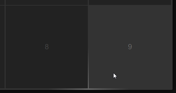
Showing the cross was the easy part. First, we need to build a simple grid of items with some horizontal spacing between them, using Flexbox and justify-content: space-between;. The vertical spacing between the entries could be done with the proper margin-bottom on each entry.
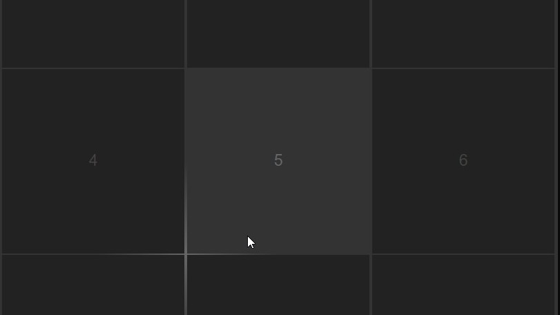
The cross itself can be a rectangle of a lighter background compared to the container, drawn as a ::before pseudo-element within each entry, having half of its surface outside the hovered entry. To visualize it, it should be something like that:
To prevent the rectangle from overlapping the entries’ content, we need to give both the entry and the container a higher z-index.
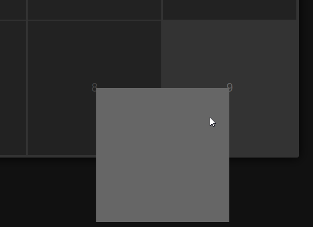
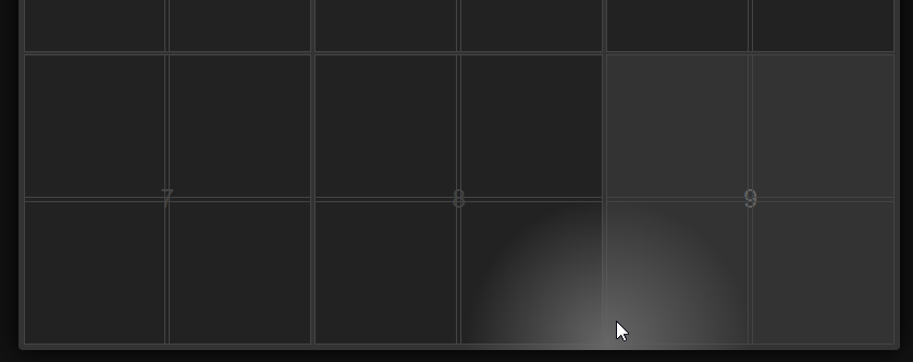
Finally, we need to smoothen its edges, to make it look like the tips of a Christmas star instead of two solid lines. To do so, we must apply some radial-gradient() to its background, starting from some solid color and ending to transparency. Then, we end up with something like that:
Detecting the corners
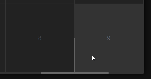
That’s nice, but how can we detect the corners of an entry without JavaScript? Well, that’s where things can get a little messy, depending on how clean you want your HTML markup to be. You see, the workaround is straightforward, but it requires to add those four corners on each entry with something like that:
<div class="entry">
  <div class="entry-content">The entry's actual content</div>
  <div class="corner-container">
    <span class="corner"></span>
    <span class="corner"></span>
    <span class="corner"></span>
    <span class="corner"></span>
  </div>
</div>
Then, we use some simple CSS to put each corner to its right place, so underneath the content, it would be something like that:
Then, we need to do two things: First, to put our pseudo-element (the one with the rectangle) on each corner. The top left corner should display its rectangle at the top left, the top right at the top right and so on.
Second, we need to bring the .content-container element in front of the corners, to hide the pseudo-element, which should only be visible between the gaps.
Here is the tricky part, though: on the one hand, we want to have the content container above the corners, to hide them, but at the same time, we want to be able to hover on each corner. Those two are mutually exclusive, as the overlapping container will prevent our cursor from detecting the corners.
Hover through an element, with pointer-events: none;
Luckily, there is a workaround for that, too. Setting pointer-events: none; on an element, keeps it visible on the screen, but when it comes to interactions, it is as if it isn’t even there. You can’t click on it; you cannot select its contents, and you can’t even hover it. Basically, you click and hover through that element, reaching what is underneath.
And there goes the hard part. The rest is just some simple and straightforward CSS, to apply some nice styling and a smooth transition, before ending up with the final result:
See the Pen Subtle cross on grid items’ corners by Giorgos (@gsarig) on CodePen.
The effect is nice, simple, and lightweight, as it doesn’t require any JavaScript. The tradeoff is that you cannot have a selectable or clickable content. If all you want is to click on the block, then converting .entry to an <a> element instead of a <div> would easily fix it. If you want to have rich text on each entry, though, then maybe you should probably look for a JavaScript solution instead.
In any case, it was a fun experiment.
If you like this article, you might also want to check out some more frontend tips.